Sacred Heart Parish Cabramatta Website Redesign
A self-initiated passion project focused on improving accessibility, clarity, and usability for a local parish community.
Role
UX/UI Designer
Front-End Developer
Photographer
Duration
2 years (Feb 2024 - Dec 2025)
Tools


The Challenge
As a volunteer responsible for uploading the parish’s weekly bulletin, I interacted with the website regularly and became increasingly aware of its limitations. While the site was functionally sound, it felt visually dated, inconsistent, and cluttered with unused elements.
These observations motivated me to explore my own interpretation of what the parish website could be. This project became an opportunity to apply what I learned during the first year of my degree, while continuing to refine my visual design and front-end development skills.
Visually Outdated Design
The current design exhibits weak visual hierarchy and adopts a purely functional approach, limiting clarity and engagement for users.
Unused Element
This page has not been updated since 2020 and is no longer relevant to parish operations following changes introduced during COVID-19, contributing to unnecessary clutter within the site structure.
Inconsistent Elements
A lack of standardised styles leads to visual inconsistency and layout issues across the site.
Typography: Inconsistent font weights cause unintended line breaks and spacing issues
Global components: Footer copyright text varies between pages, reducing cohesion
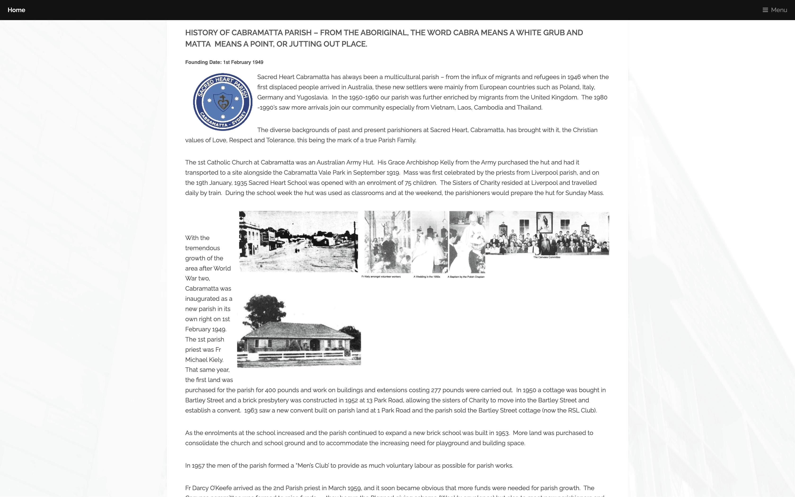
Text-heavy Pages
Extremely text-heavy content limits readability and engagement.
Design Goals
With these challenges in mind, the goals for the redesign were to improve visual hierarchy and clarity of information, establish a consistent and reusable design system, simplify the site by reducing outdated or unused content, and create a welcoming visual language suited to a faith community. Additionally, the redesign aimed to better reflect parish life and engagement through new content sections and photography.
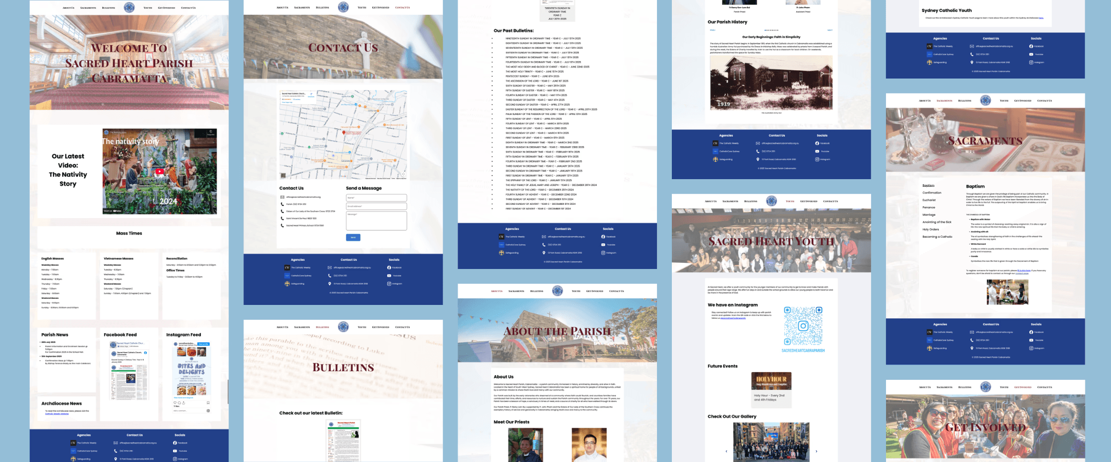
Early Exploration and Iterations
Version 1 (Figma)
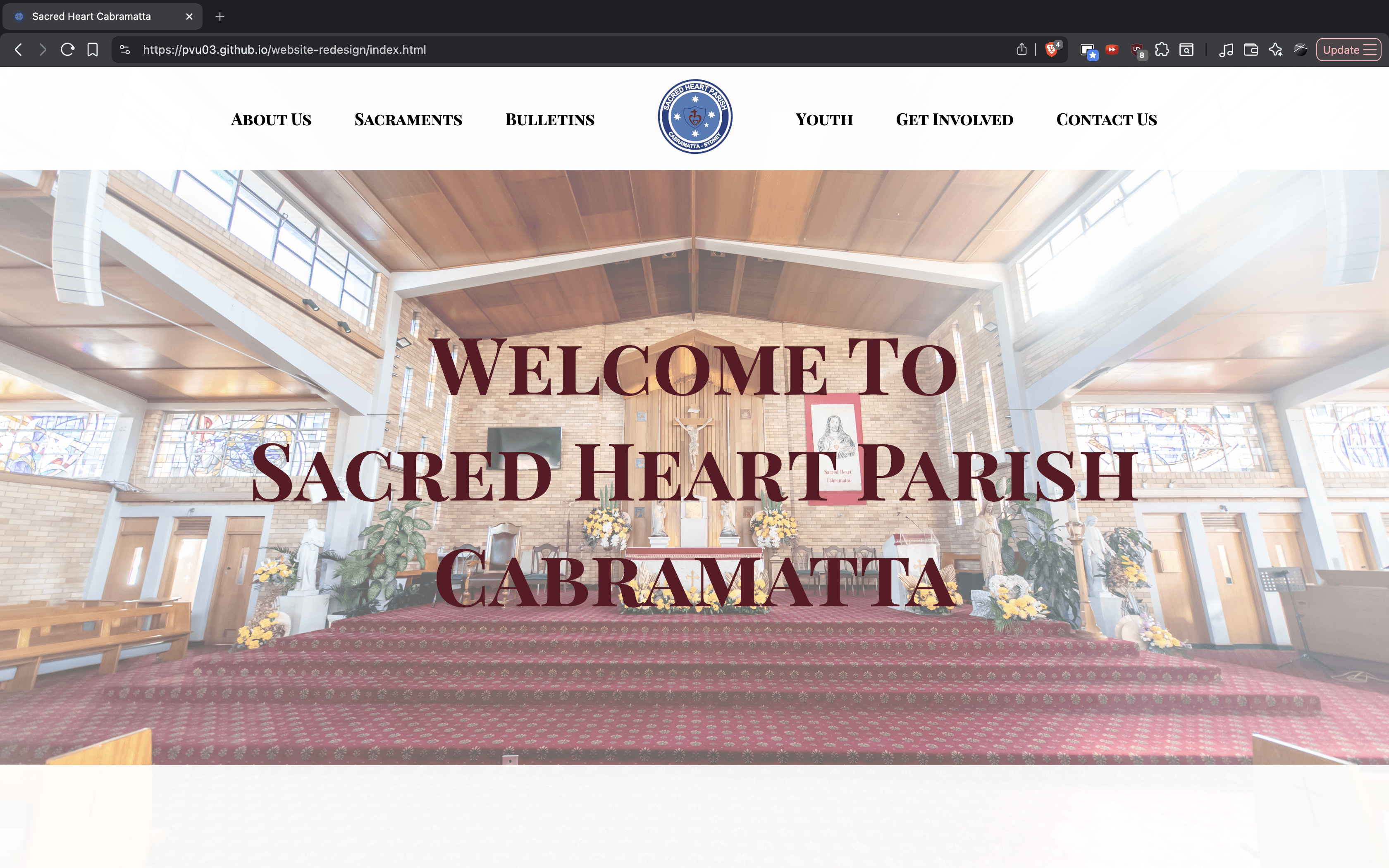
Final Version (Fully Coded)
Iterations
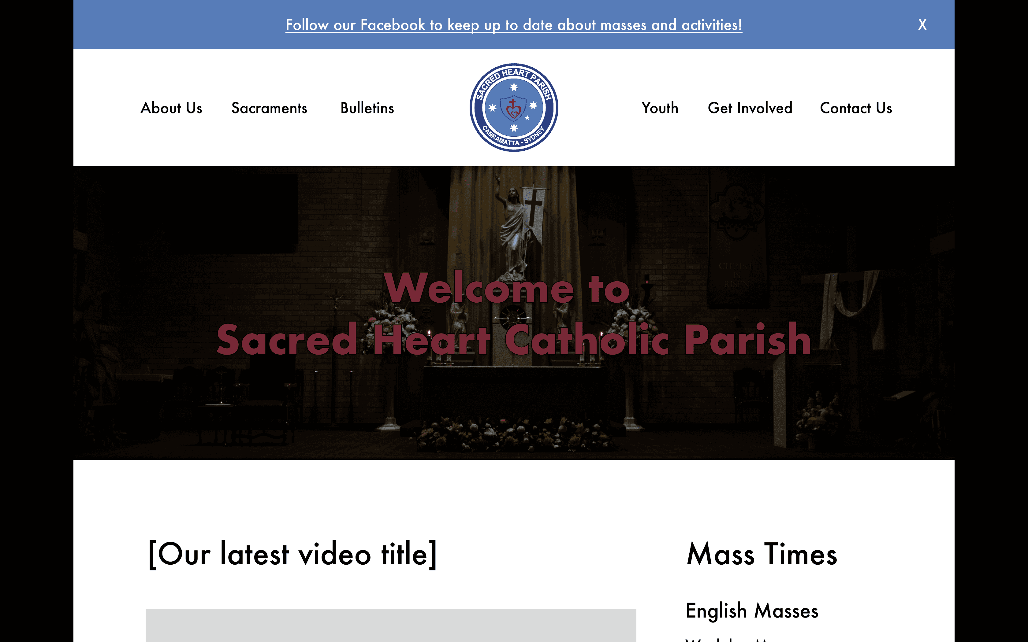
The original landing view was oversized, unresponsive, and relied on simple typography that conveyed hierarchy but lacked visual style. Iteration improved hierarchy, spacing, and imagery, resulting in a fully responsive, readable, and welcoming landing experience.
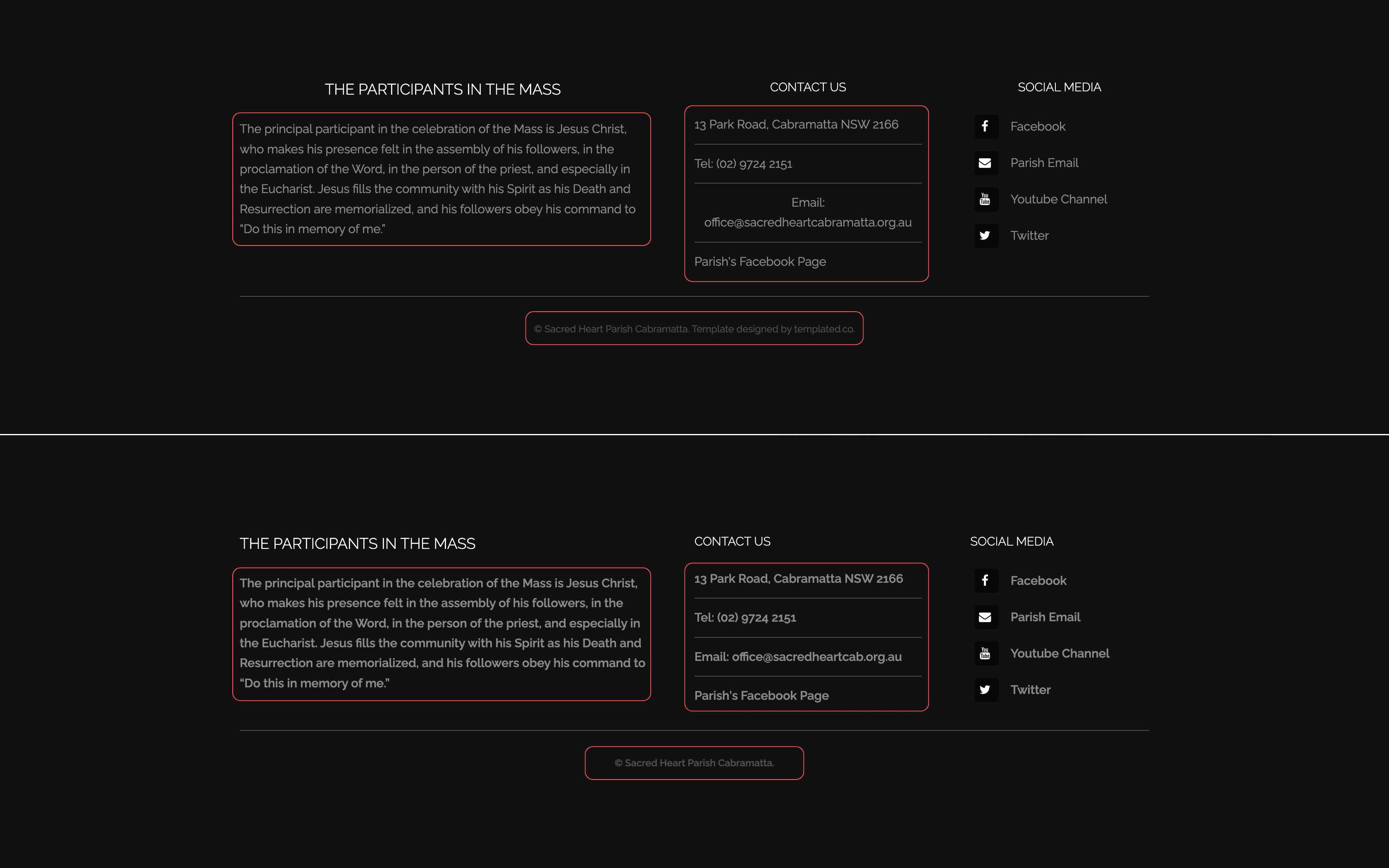
In V1, all content was cramped into a single block, making it difficult to scan. The final design splits the content into three clear sections, improving readability, hierarchy, and accessibility, while replacing a less-used feature with new sections that highlight parish news and important information.
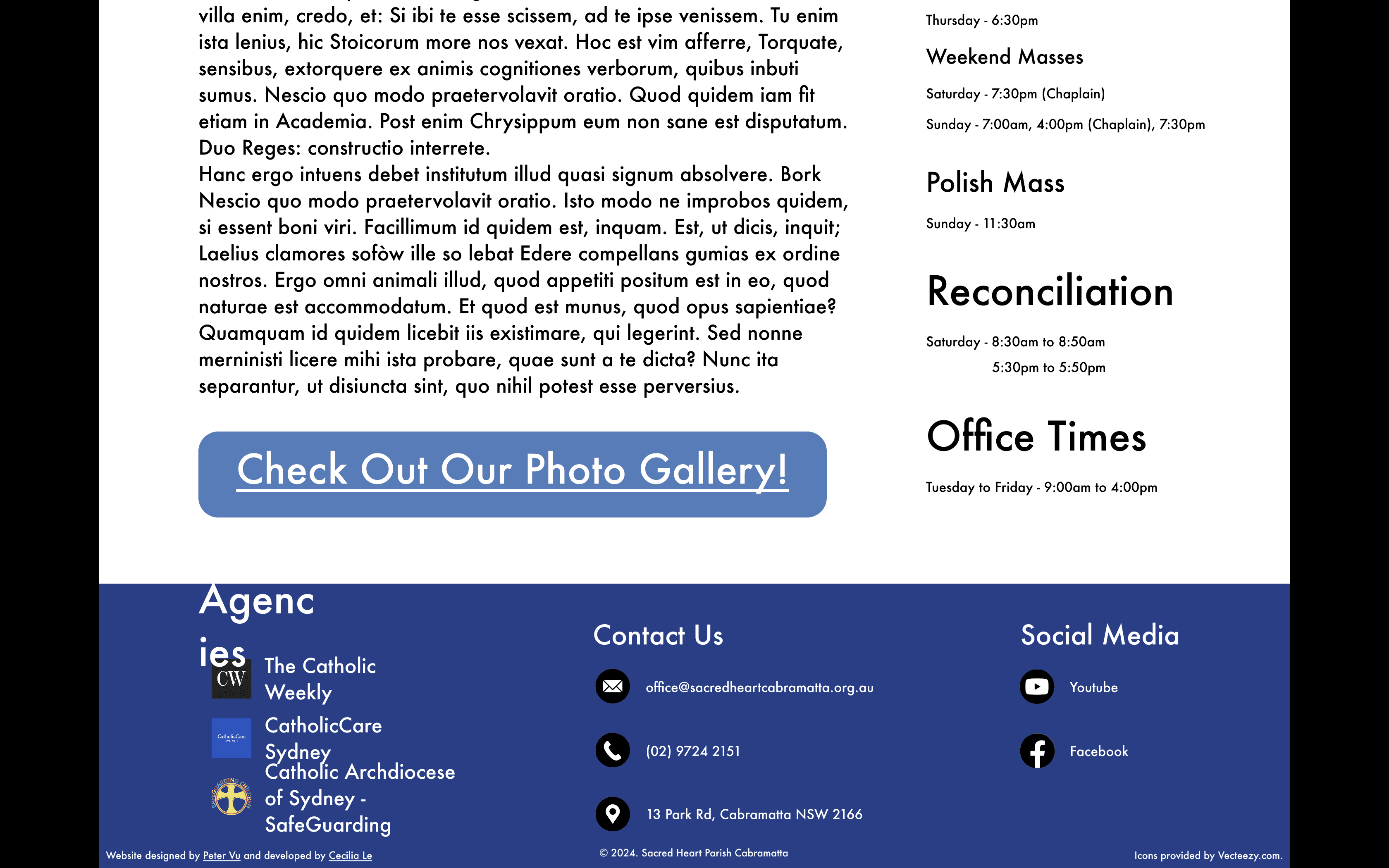
In V1, footer typography was inconsistent across pages due to experimentation, and the black borders around white icons were unnecessary. The final design standardised typography, refined spacing, and replaced icons with cleaner alternatives for a more cohesive and polished footer.
Design Style Guides
Typography
Heading 1
Playfair Display - 96px
Used for primary page titles
Heading 2
Poppins - Bold - 36px
Used for section hierarchy
Heading 3
Poppins - 24px
Used for subsection headings and content grouping.
Heading 4
Poppins - Bold - 16px
Functions as a utility heading for labels and UI elements.
Paragraph 1
Poppins - 16px
Used for main body text
Paragraph 2
Poppins - Italics - 14px
Used for captions
Colour Palette
#000000
Paragraph Text
#FFFFFF
Section Background
#F9F9F9
Page Background
#223F89
Structural Accent
#5E1625
Heading 1/Highlights
The palette draws directly from the parish logo, using restrained neutrals and deep accent colours to create a calm, grounded, and recognisable visual identity.
Final Design
Home Page
Landing / Hero Section
Establishes hierarchy and welcoming tone for the parish community.
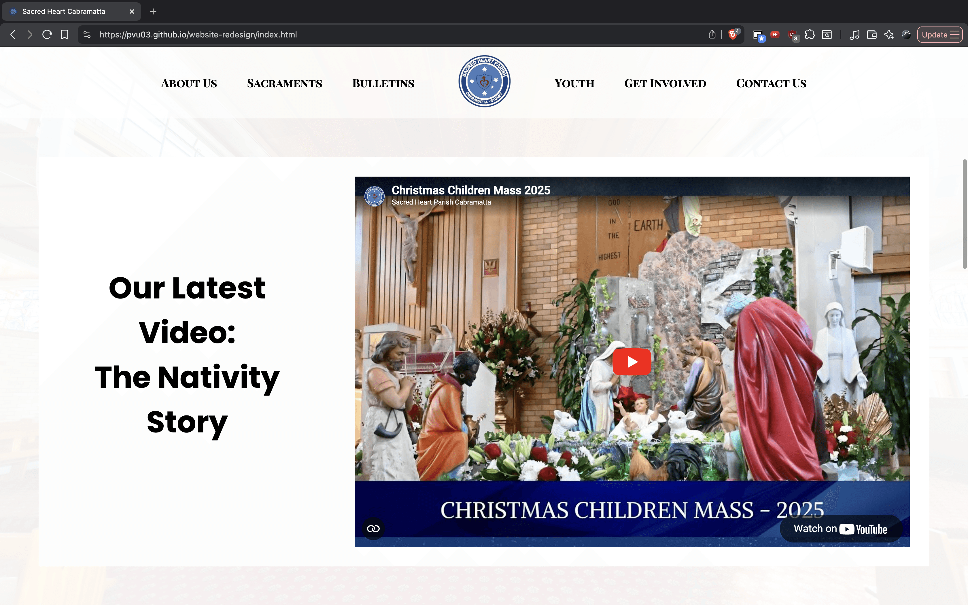
Media Section
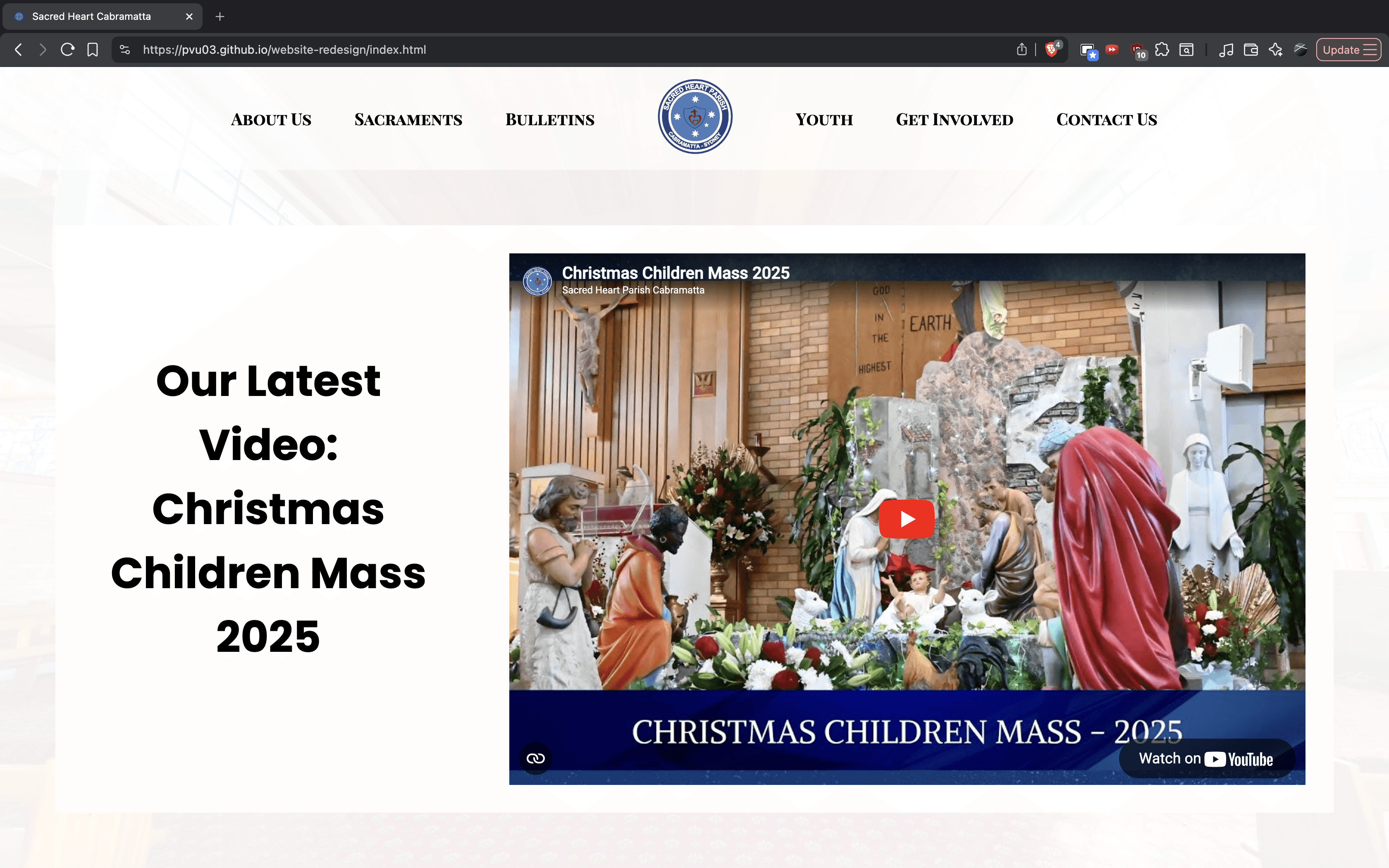
Highlights parish's latest Youtube Video.
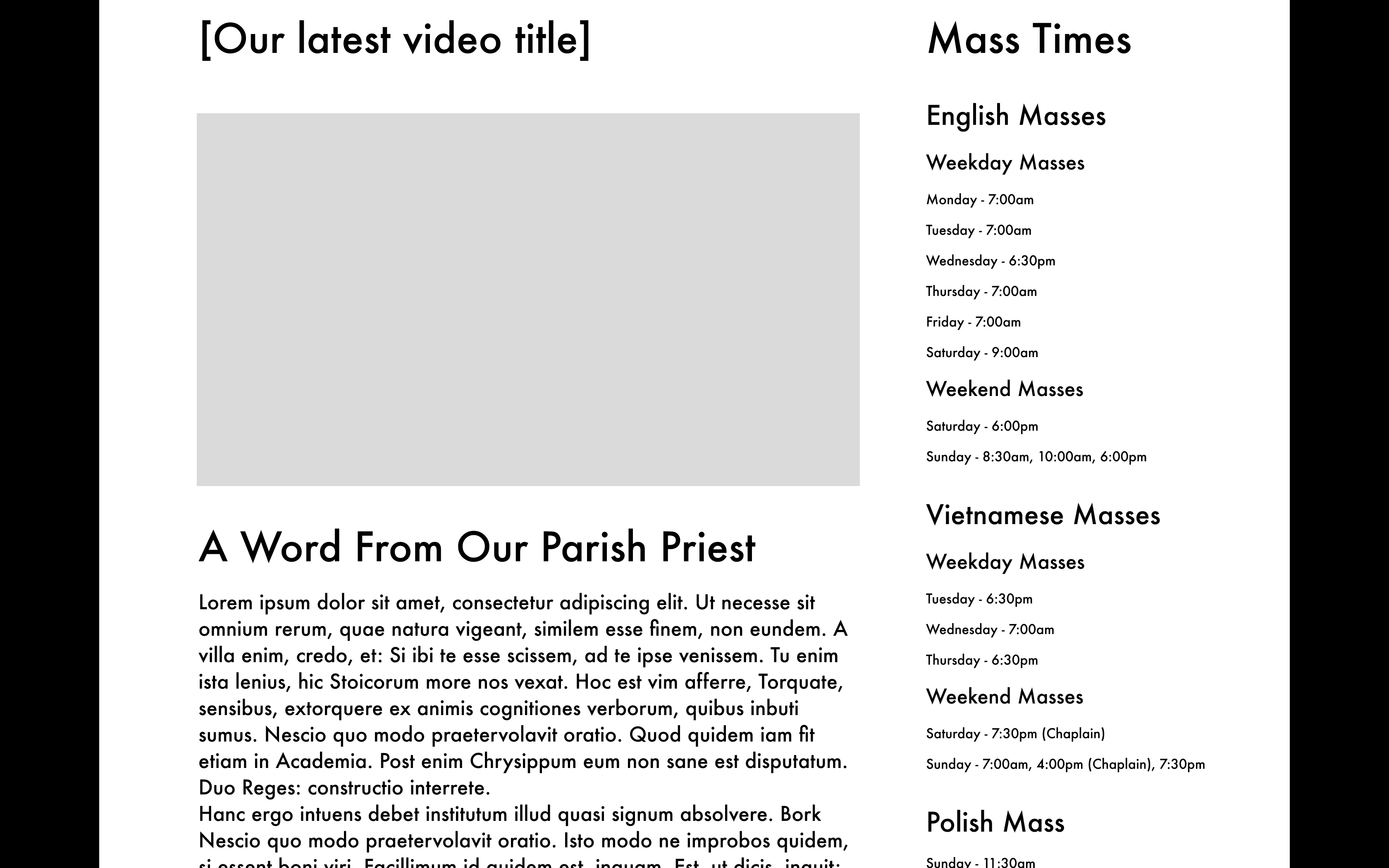
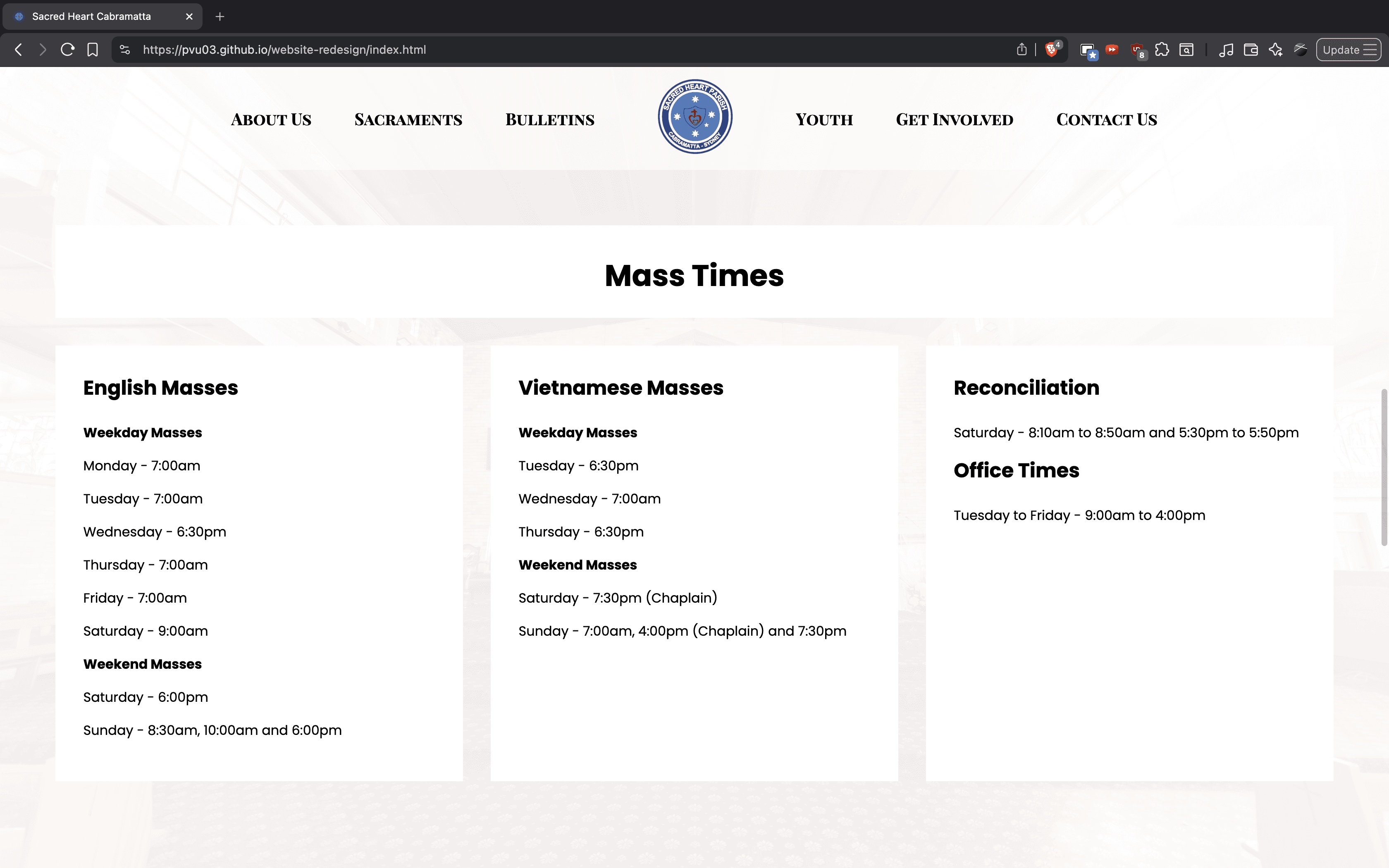
Mass Times Section
Redesign of the Mass Times layout allows for a clear, visually structured layout that is easier to scan at a glance.
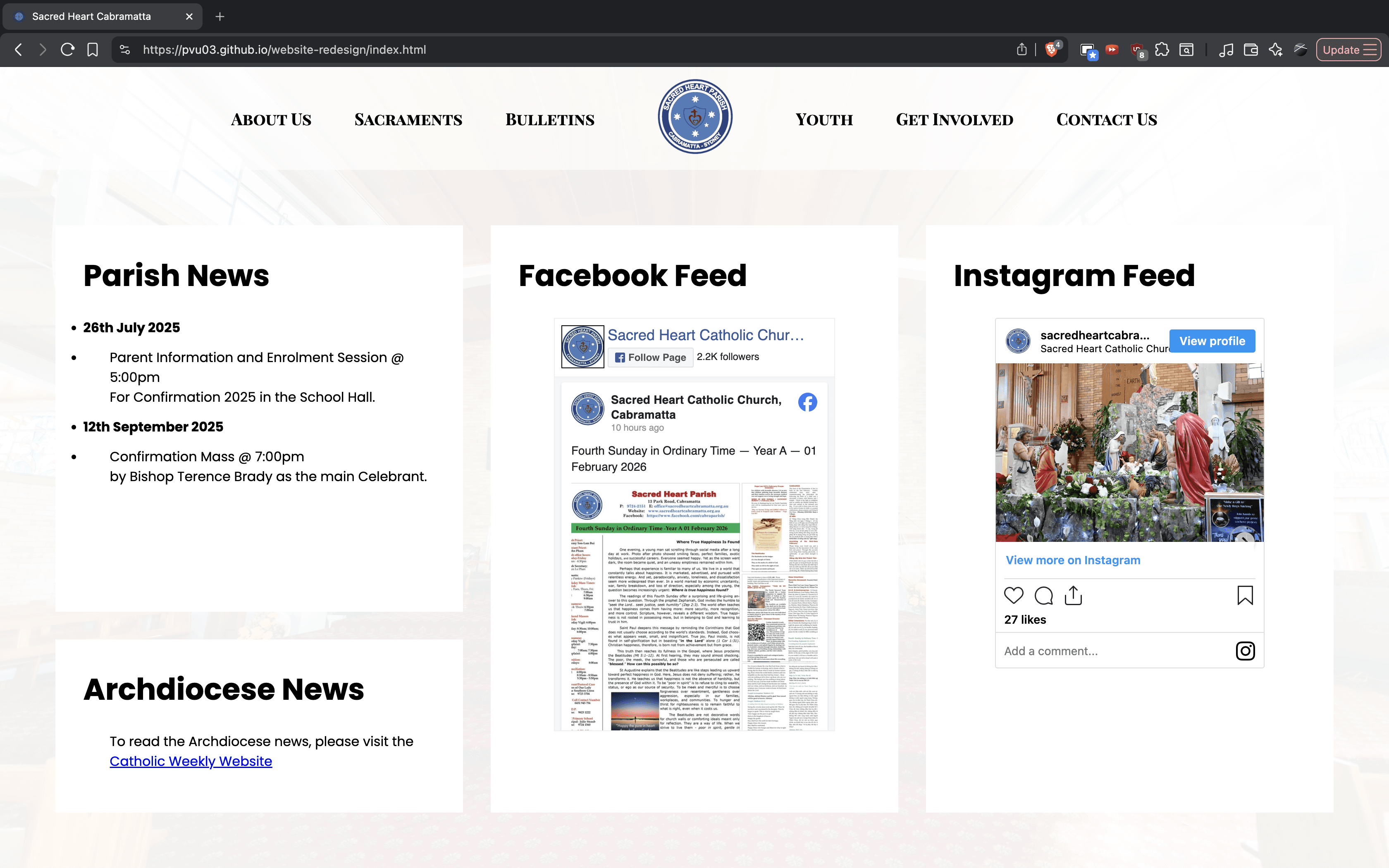
Parish News & Socials Section
Displays current news and recent socials to engage the community.
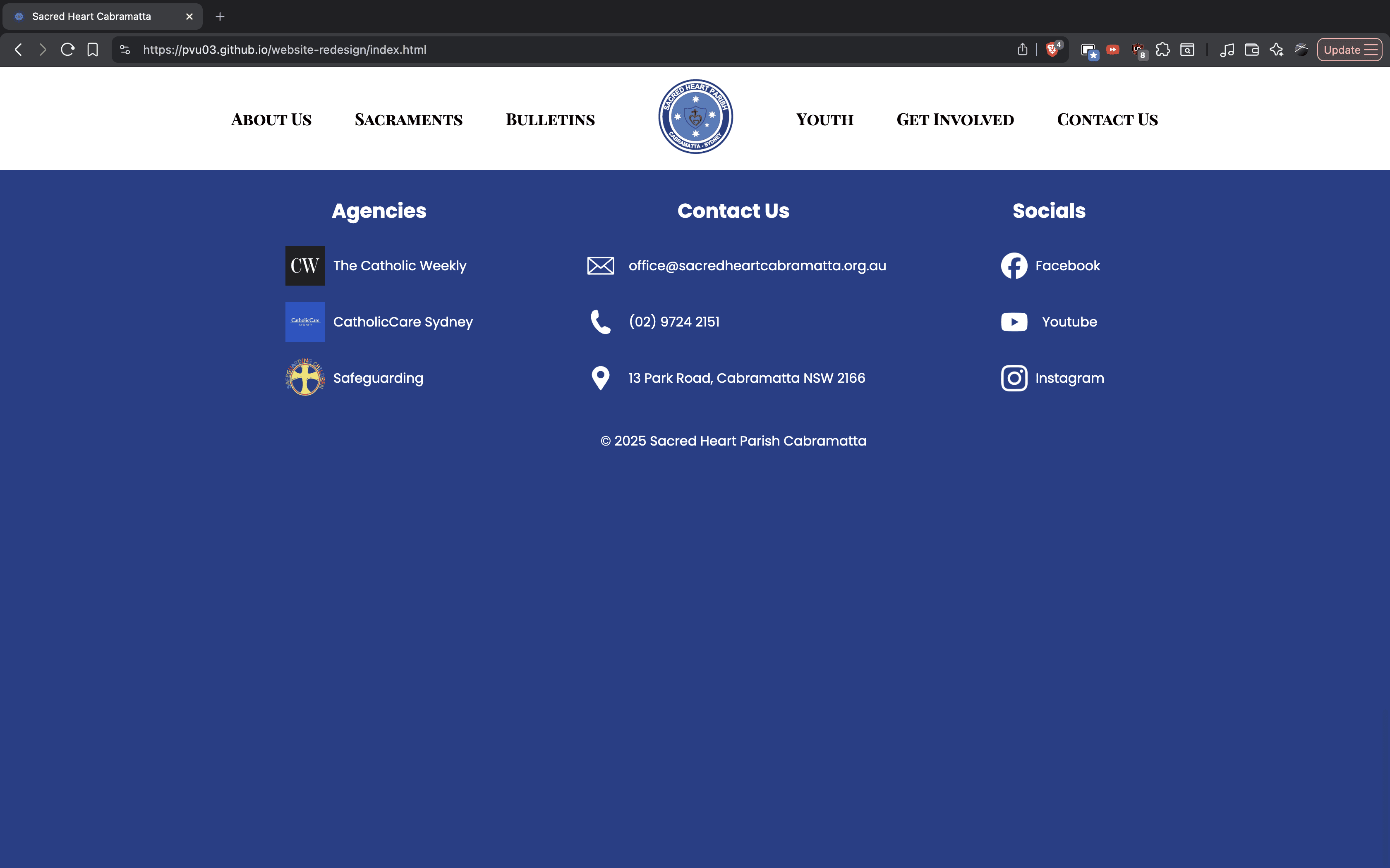
Footer Section
Standardised typography and simplified icons improve cohesion and brand consistency. Moving the agencies ensures that important references are easily found across all pages
About Us Page
Welcome Section
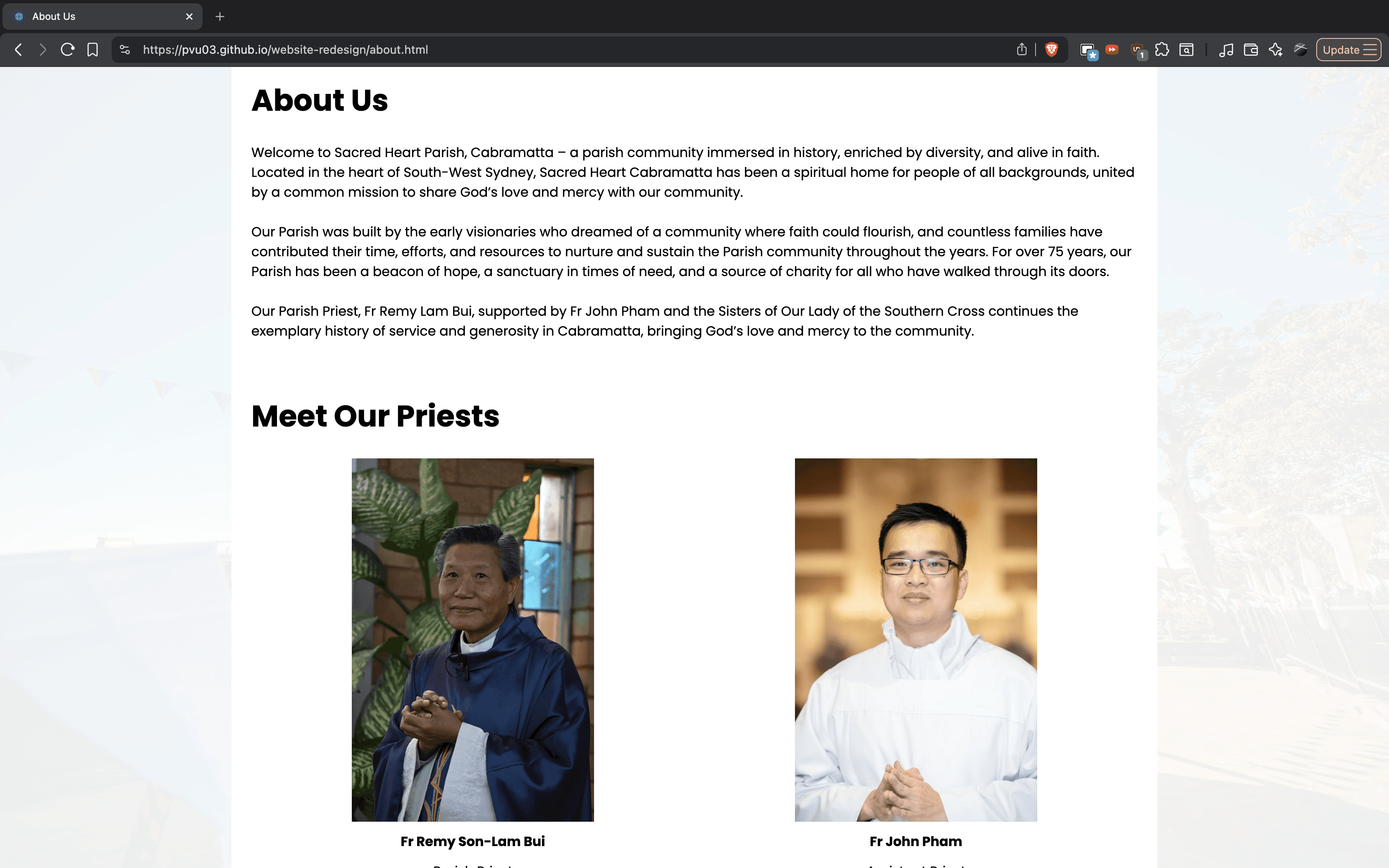
Introduces a dedicated welcome section that was missing from the original site, helping orient visitors before deeper parish information.
Parish History Slideshow
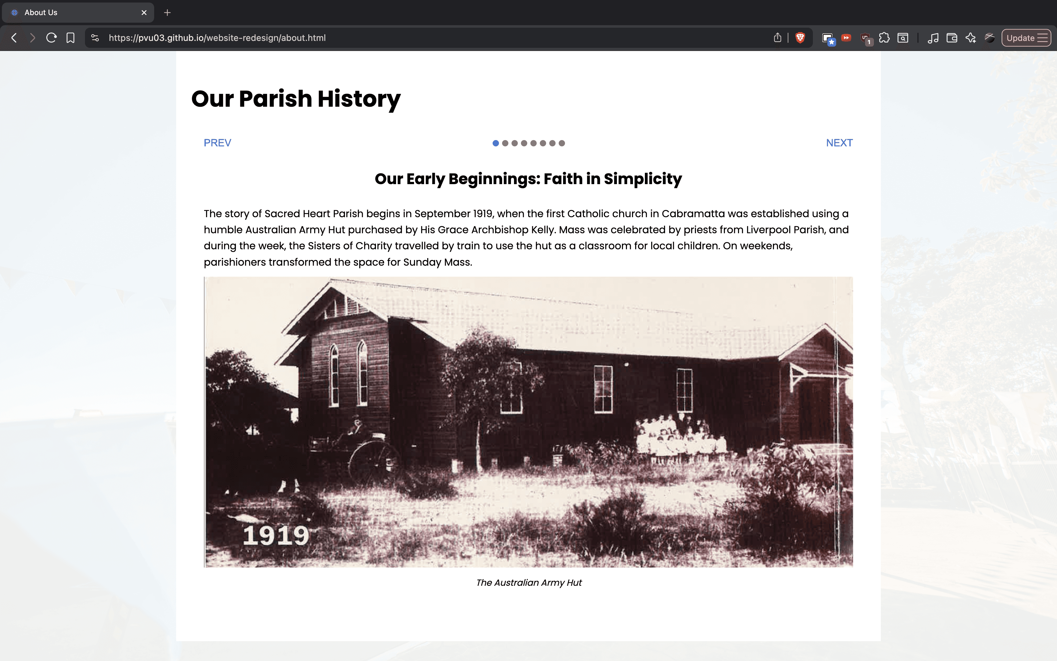
Visual, interactive slideshow replaces dense historical text to make content engaging.
Key Internal Pages
Youth Page
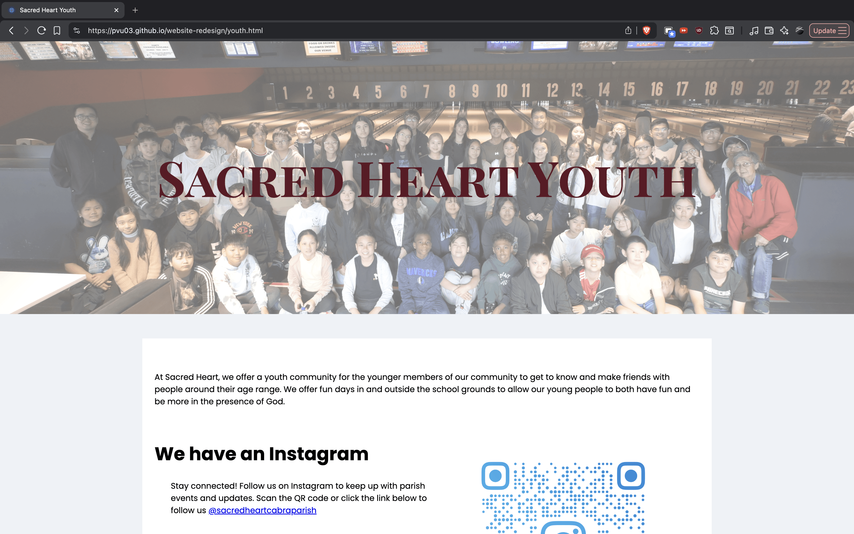
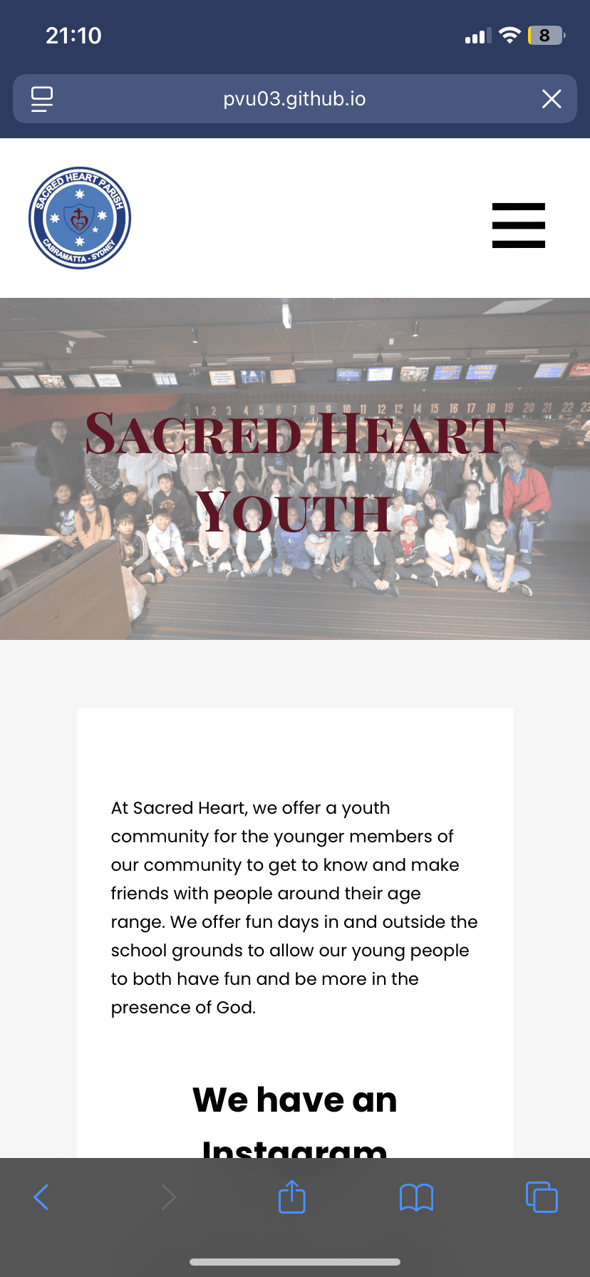
Addition of a Youth Page allows for introduction of the Youth group while giving them updates on events they could be a part of.
Get Involved Page
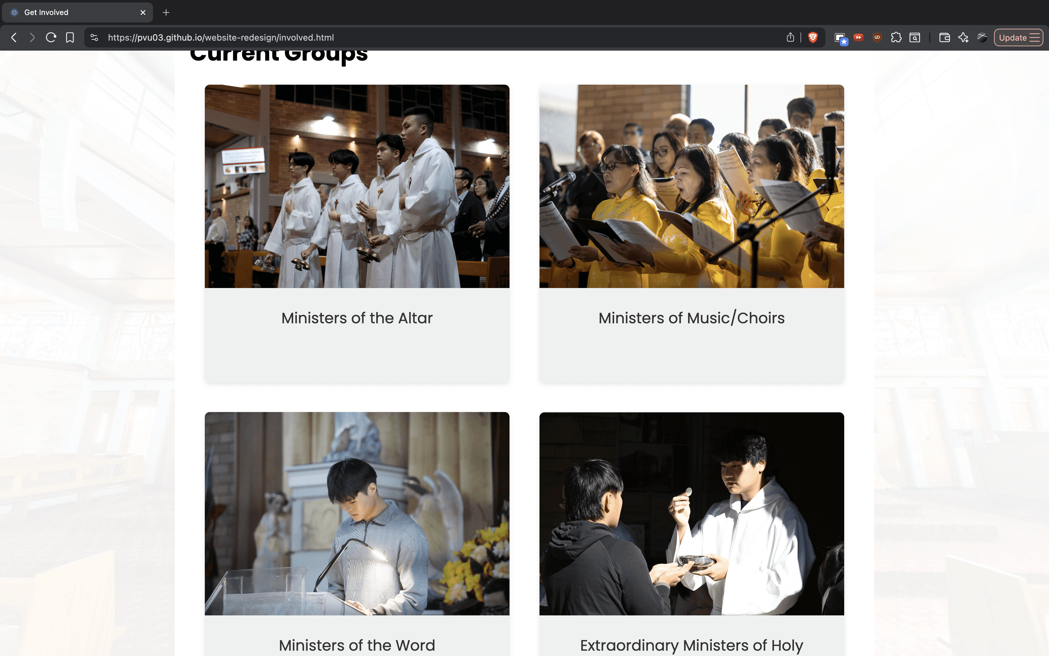
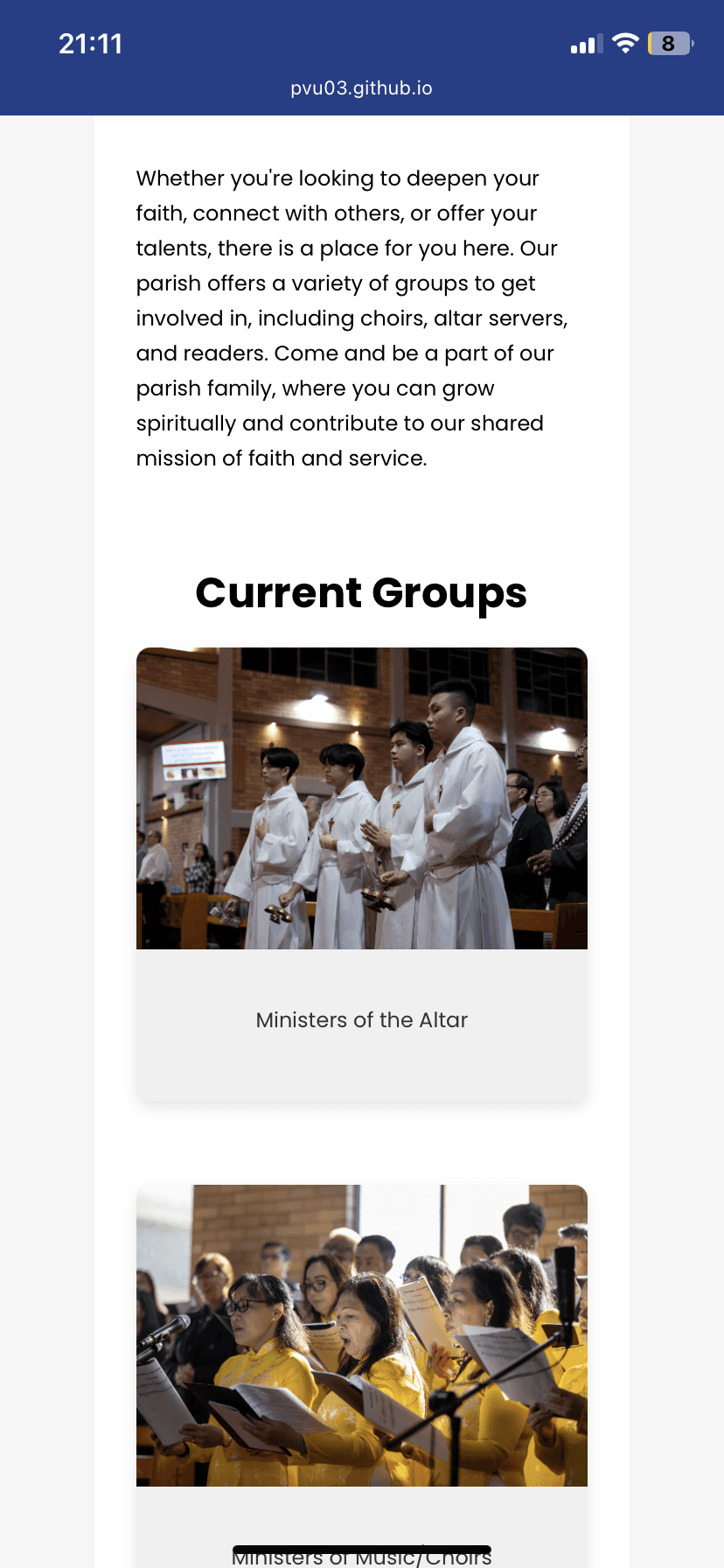
The Get Involved page highlights volunteering opportunities and parish initiatives.
Reflections & Takeaways
I began this project after completing my first year of my degree as a way to continue practising web and interface design beyond my initial coursework. As the project progressed, I was learning alongside the work itself, which allowed me to strengthen my understanding of responsive layouts, front-end development using CSS and JavaScript, and more considered visual design decisions.
Something I will take away from this project is how much iteration is required to arrive at a confident design. Seeing designs move from Figma into a live environment highlighted issues that were not immediately obvious and reinforced the value of refining decisions through implementation.
Looking back, I would redesign the Sacraments page earlier, as implementing and living with the coded version revealed areas for improvement in hierarchy and visual clarity. If continued, future improvements would include refining carried-over content, completing the mobile homepage experience, and introducing a gallery page to better reflect parish life and community engagement.
Say hi — I don’t bite:
I swear

© Peter Le Vu - 2025