Phu Quoc Travels
A destination microsite showcasing Phu Quoc, a Vietnamese island off the coast of Cambodia, created to explore the fundamentals of web design and front-end development through a university project.
Role
UX/UI Designer
Front-End Developer
Duration
9 weeks (Sep - Nov 2023)
Tools


The Challenge
For my first web design and development project in DECO1016, I was tasked with creating a small microsite of a location of my choosing. I chose to showcase Phu Quoc, a Vietnamese island off the coast of Cambodia in the Gulf of Thailand, selecting it because of my personal experiences at the location.
The site needed to communicate the island’s attractions, culture, and experiences while remaining visually engaging and easy to navigate. Working within the microsite format (1–5 pages) challenged me to prioritise content, apply basic design principles, and explore responsive layouts. This project served as an opportunity to practice wireframing, layout, typography, imagery, and front-end coding in a real, tangible way.
Process & Decisions
Research & Direction
To start this project, I did some research on Phu Quoc's attractions, cultures and experiences. This allowed me to define a target audience and establish the site’s purpose: to showcase the island in a way that was visually appealing, informative, and easy to navigate.
To guide content, layout, and visual decisions, I defined a primary visitor persona representing family-focused travellers.

Sarah Thompson - 35
Family-focused traveller
Married, mother of two
Research-driven when planning trips
Seeks culturally immersive yet relaxing destinations
Goals:
Strengthen family bonds · Explore local culture · Relax and recharge
“A perfect vacation is one where we can explore, relax, and connect as a family.”
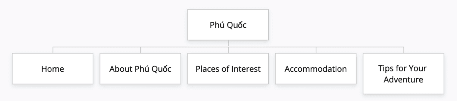
Following this, a site map was developed to organise content and define page hierarchy for the microsite, ensuring a clear navigation structure and prioritisation of key information.
Early Concepts/Sketches
Early sketches and digital wireframes helped define the layout, hierarchy, and functionality of each page, guiding the transition from concept to coded prototype. Sketches prioritised speed and ideation over visual detail, allowing rapid exploration of layout and content hierarchy. Shown here are key pages that demonstrate layout and navigation decisions.
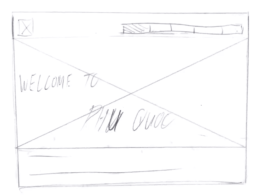
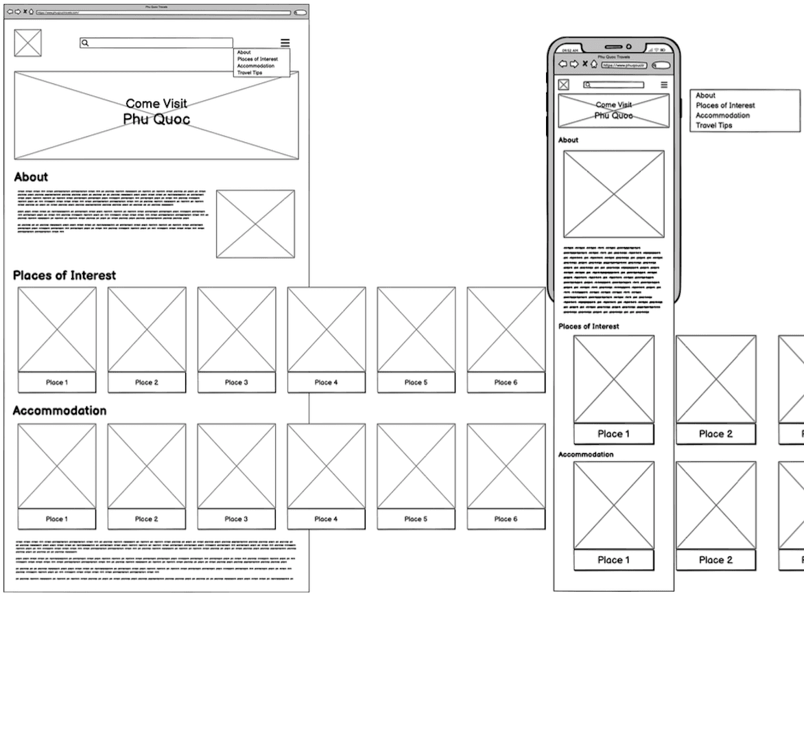
Homepage – focused on hero content and a quick overview of other pages
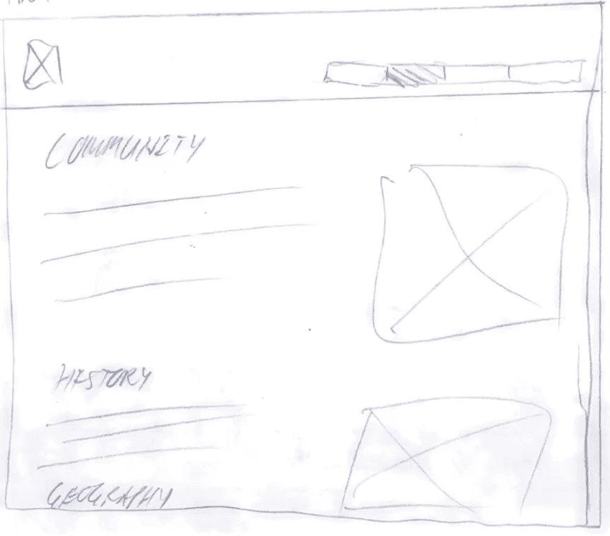
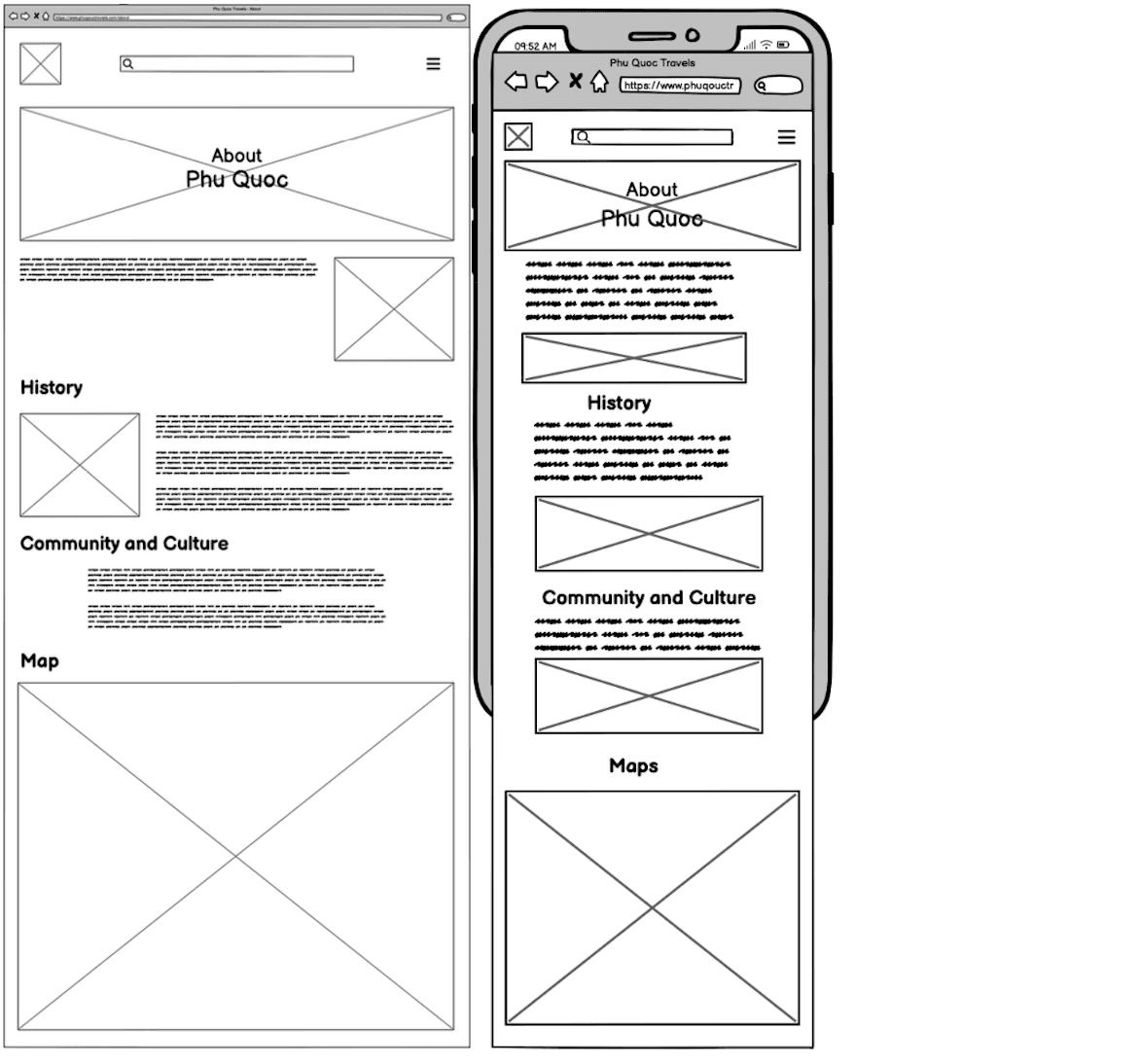
About Page - lightly focuses on the history and culture of Phu Quoc
Visual Direction
Typography
Heading 1
Rock Salt - 128px
Used for primary page titles
Heading 2
Rock Salt - 72px
Used as smaller title in banners
Heading 3
Cantora One - 64px
Used for subsection headings and content grouping.
Heading 4
Cantora One - 32px
Used for filter labels
Paragraph
Maitree - 24px
Used for main body text
Input
Times - 32px
Used for inputs
Colour Palette
#000000
Paragraph Text
#FFFFFF
Background Colour
#D1772E
Structural Accent
#D5E7F6
Section Background
#61B8FF
Search Bar
The palette takes up colours that I thought would evoke a tropical, sunny, and welcoming atmosphere
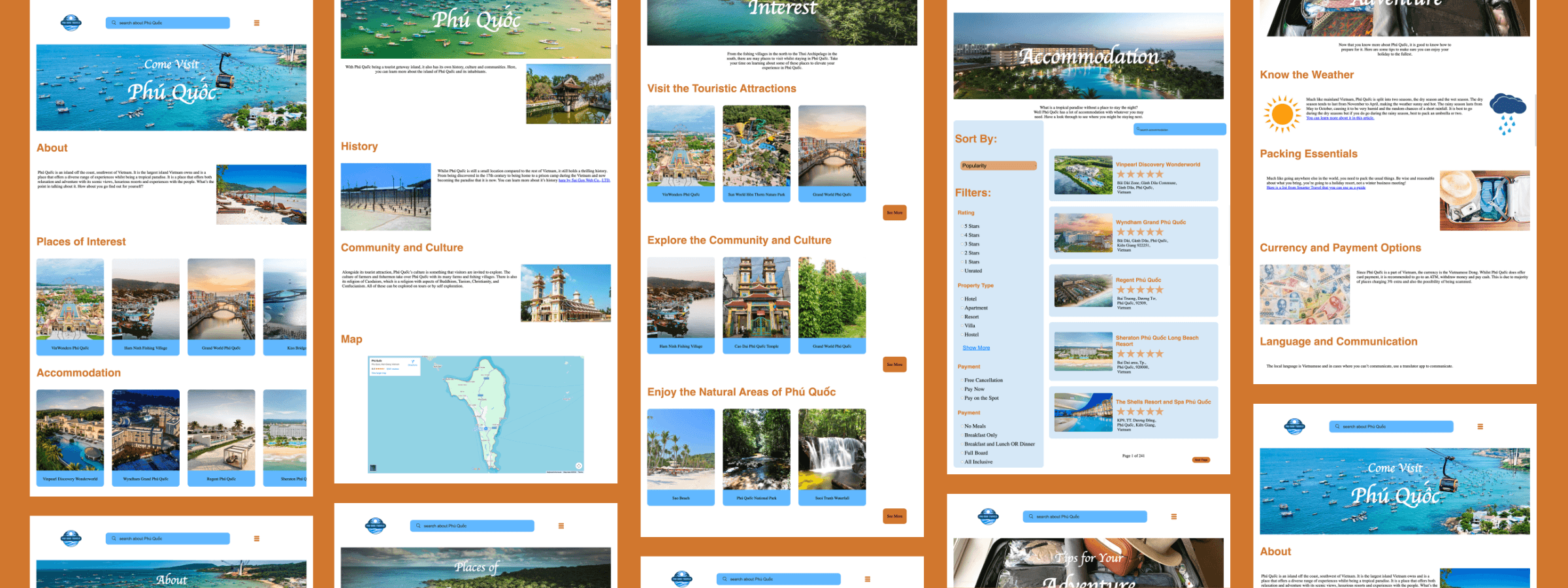
Final Design

Reflections & Takeaways
As mentioned earlier, this was my first experience designing and developing a website. Throughout the process, I was learning and applying the fundamentals of web design, which gave me a strong foundation to take on larger projects in the future and motivated me to continue improving in this area.
Looking back, I can see several areas for improvement, both visually and functionally. Some alignments are off, certain components are missing, and the overall functionality could be refined. Given the skills and knowledge I had at the time, however, I am satisfied with what I was able to accomplish.
If I were to revise the website now, I would add a footer to provide a clear conclusion to each page, change the dropdown menu to a traditional menu bar for better usability, and adjust the search bar to a less prominent color, so it blends more seamlessly with the overall design. These adjustments would help create a more polished and cohesive user experience.
Say hi — I don’t bite:
I swear

© Peter Le Vu - 2025